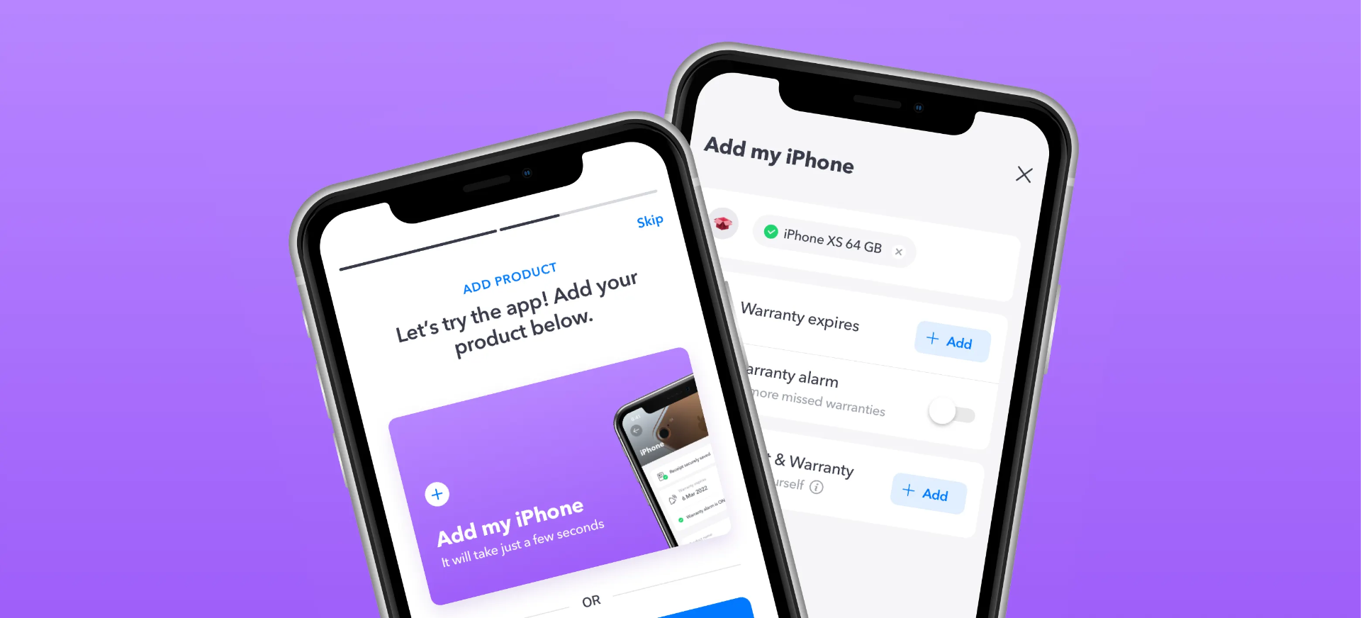
Context
Think about the last time one of your appliances stopped working.
Where's the receipt? Is it still under warranty? Where's the manual? How do you contact the manufacturer?
For most people, the answer is somewhere between "I have no idea" and "I'll probably just buy a new one."
That was the problem ZenOwn set out to solve.
Instead of stuffing receipts into drawers or losing them in old email threads, the idea was to create a digital home for everything people owned. A place where receipts, warranties, product information, and support all lived together.
It started with organization.
It quickly became much bigger than that.
Home screen, designed in 2021. The idea was to keep all essentials in one place: the top section shows the user's products (above the fold), followed by recommended products, tips and tricks, and access to partners. The home screen served as a hub for all these areas.
Building Before AI
I joined ZenOwn as the founding Product Designer. I was also the only Product Designer, and as such, responsible for the entire product experience.
This was years before AI became part of everyday design workflows.
Every feature started with conversations.
We wrote user stories, mapped user journeys, sketched ideas, created wireframes, tested concepts, and gradually transformed them into polished interfaces using Sketch.
Nothing was generated.
Every screen, every component, every interaction was designed by hand.
Looking back, it was one of the best ways to learn product design because every decision forced you to think before you designed.
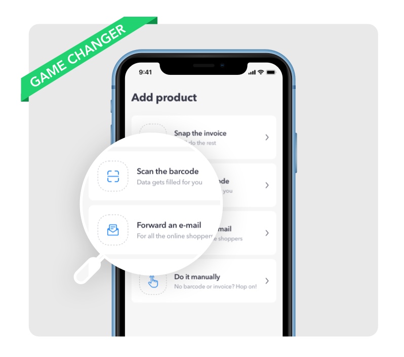
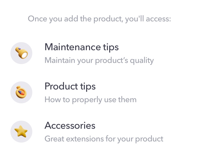
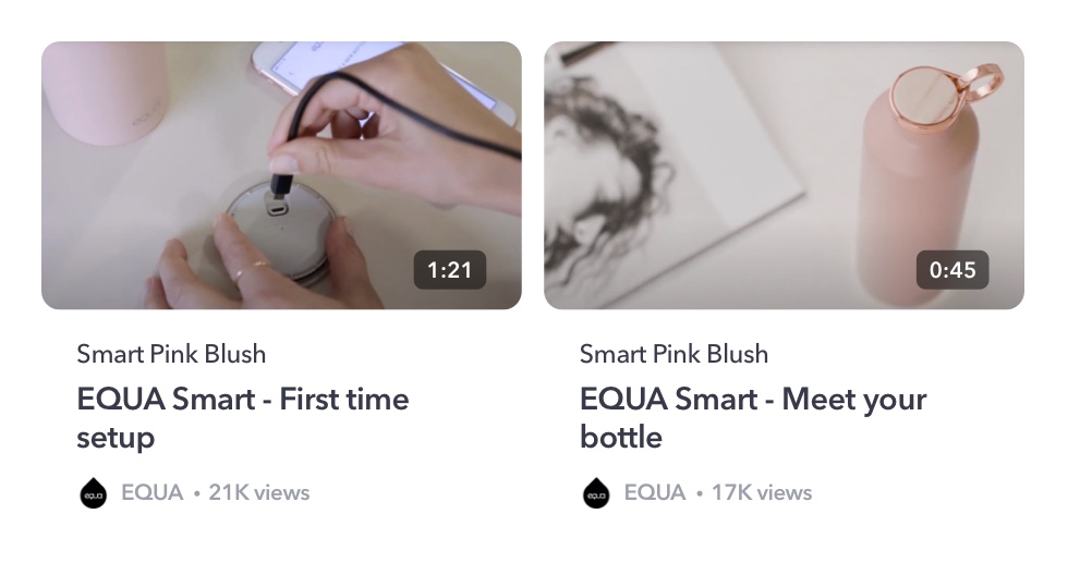
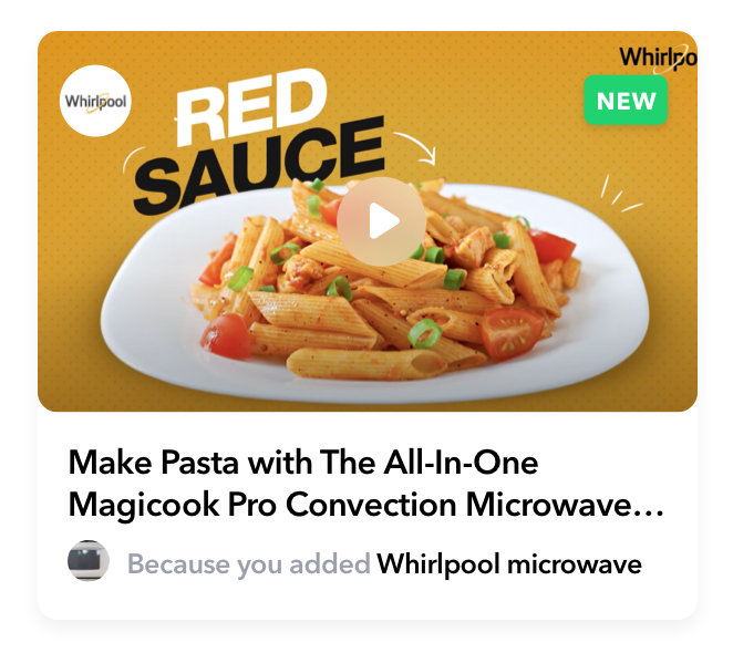
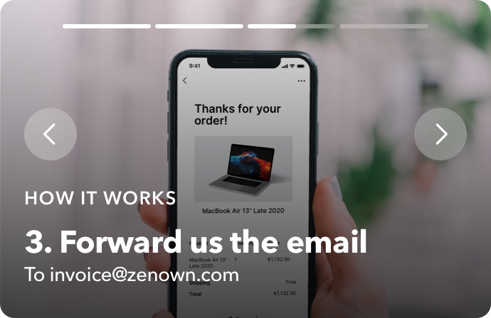
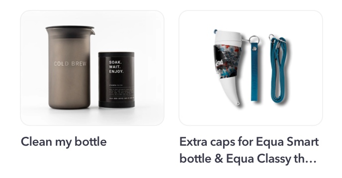
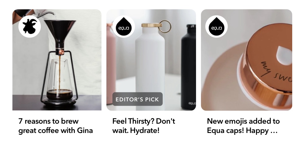
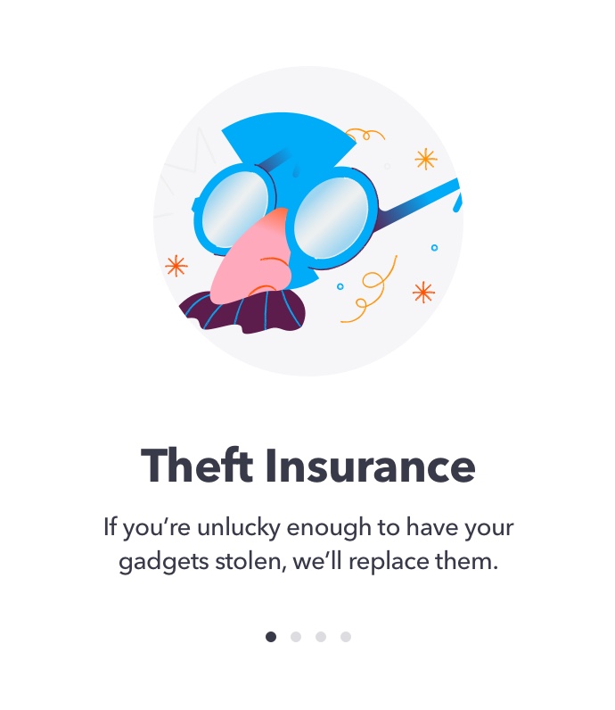
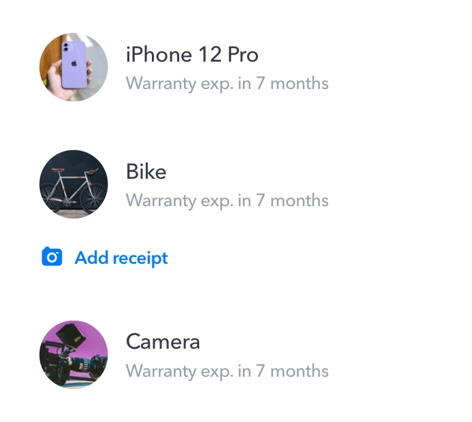
A small sample of the components I designed. The UI style was pretty minimal with visuals being the prominent part for browsing products, watching tips, or just making things such as insurance feel a bit more friendly.
From Receipt Storage to an Ownership Platform
What started as a receipt manager gradually evolved into something much more useful.
Users could:
- Store digital receipts
- Track warranty expiration dates
- Receive warranty reminders
- Access manuals and product information
- Purchase insurance for selected products
- Discover tips for products they already owned
Some of the features I've shipped...
Brand Space
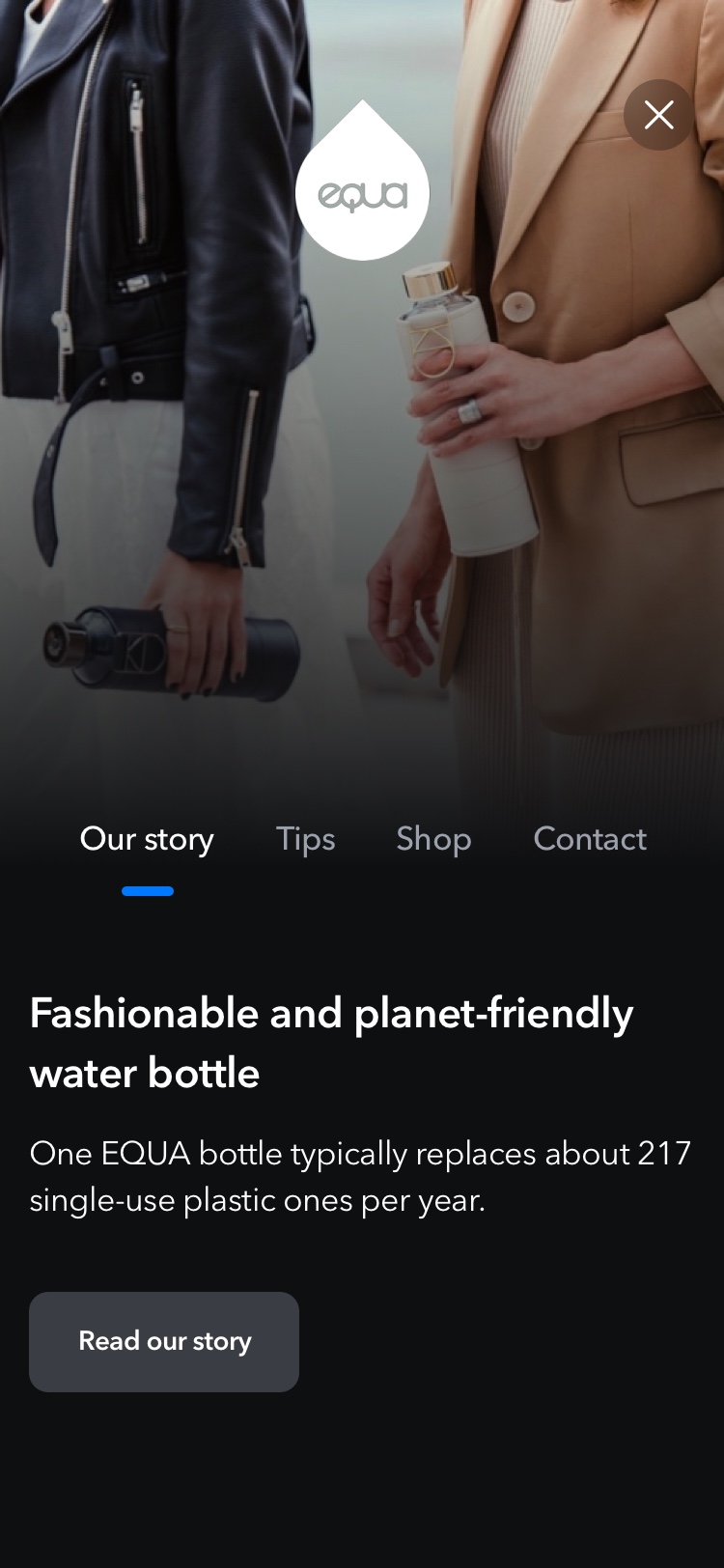
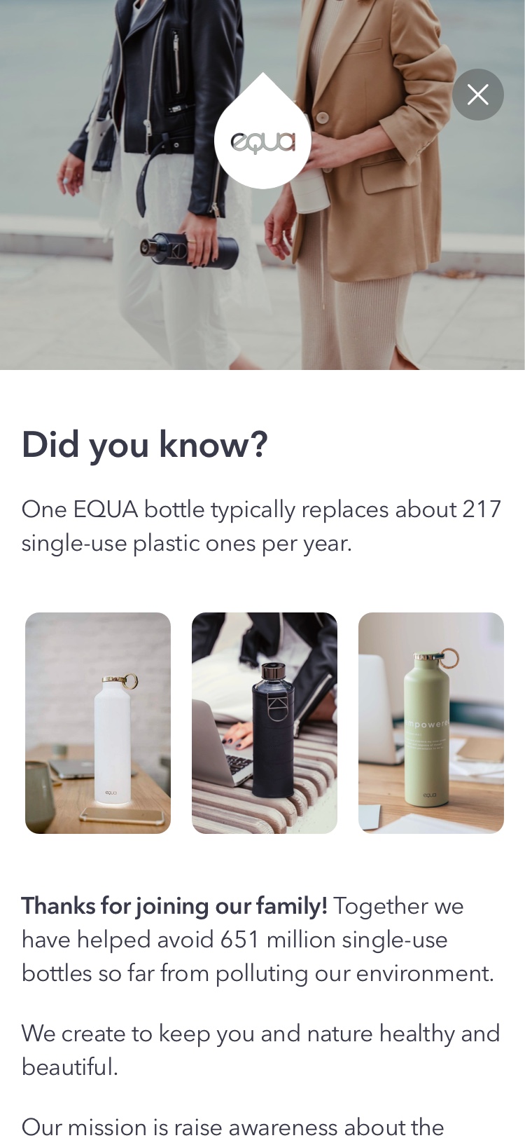
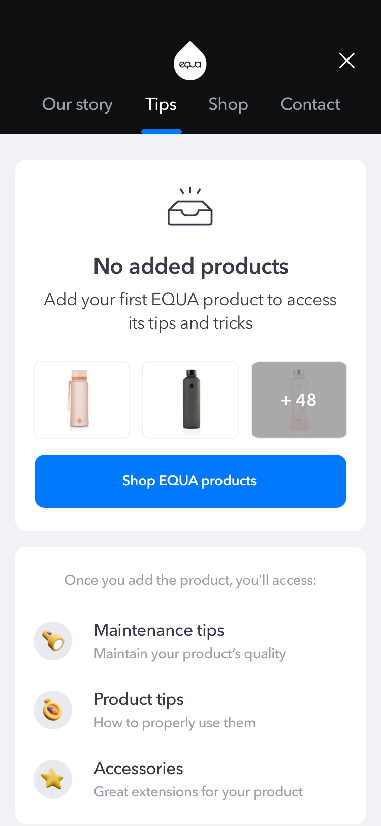
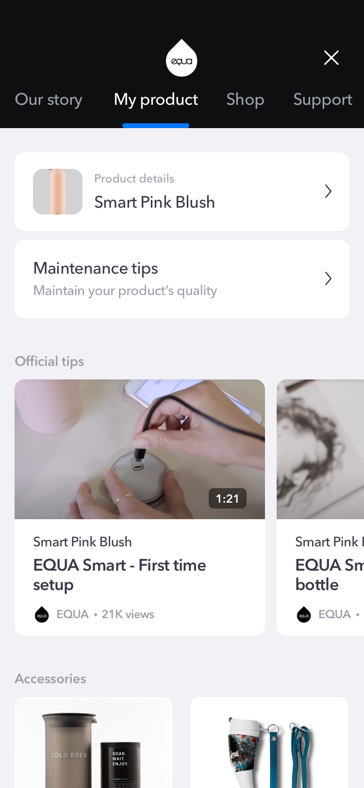
Instead of treating brands as logos attached to products, we created dedicated spaces where users could continue their relationship after the purchase. We've partnered with companies to bring that mission to life. Users could browse partner products, discover useful tips, and contact customer support. It shifted the experience from simply managing ownership to actually enhancing it.
PARTNERED WITH


Add product
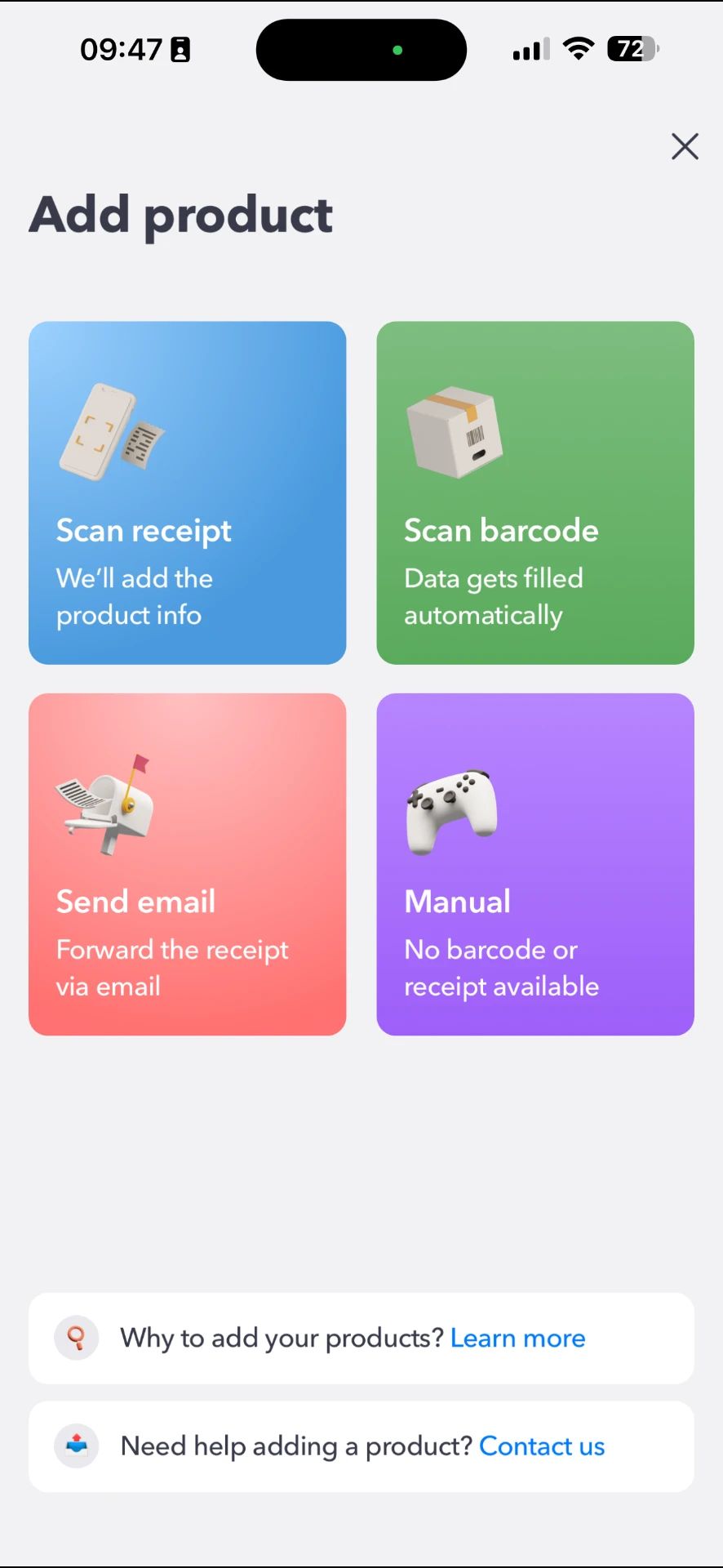
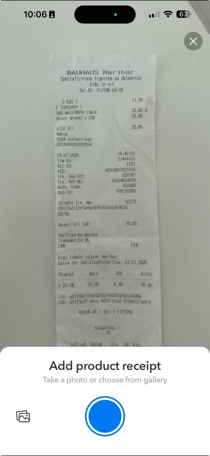
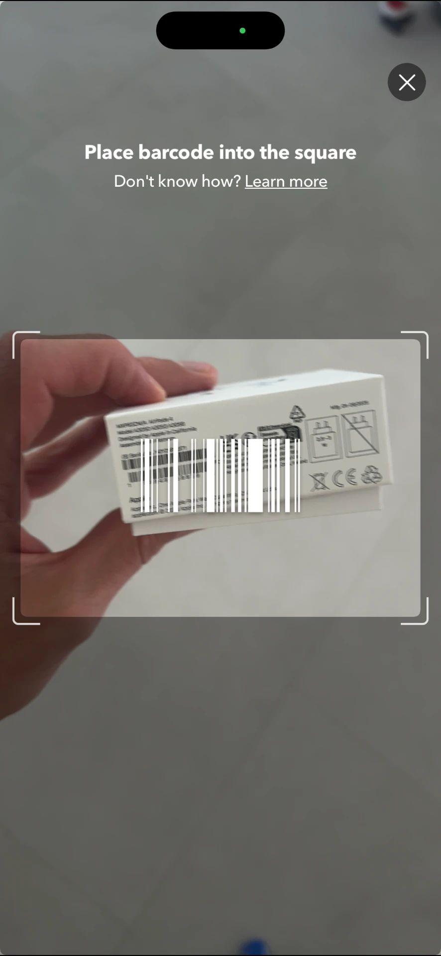
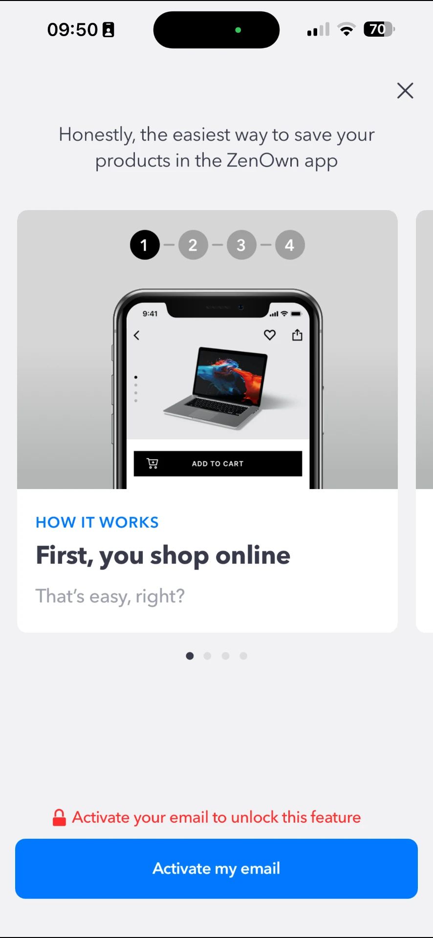
The most common method used by users was scanning the receipt. A fast, camera-first flow that turned paper receipts into structured product records. Users could snap a receipt, and the app extracted key details like date, retailer, and product name so everything was searchable the moment it was captured.
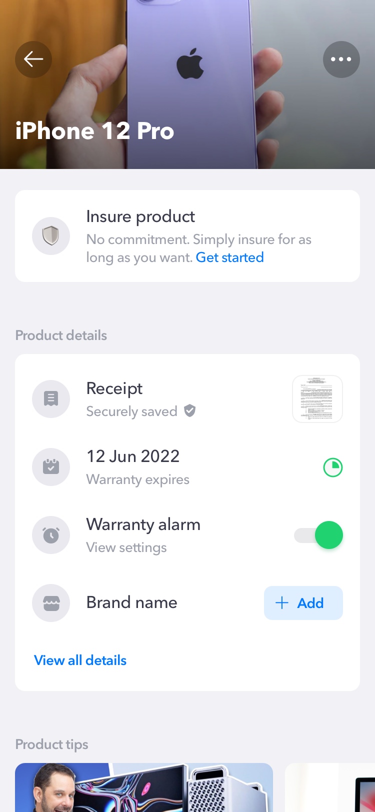
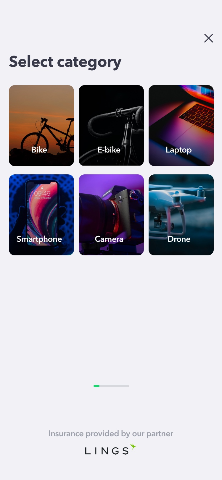
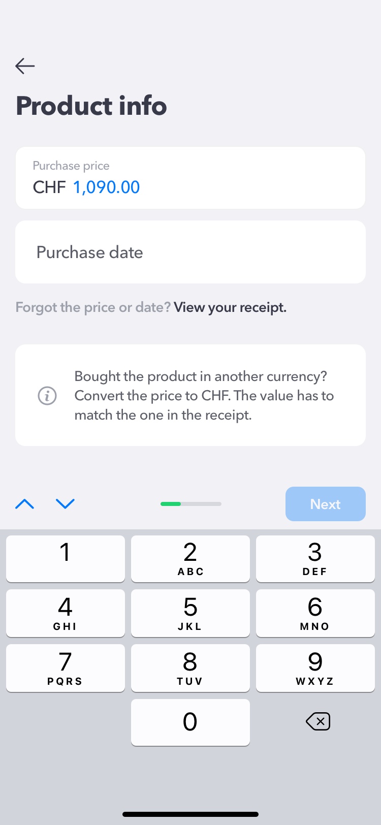
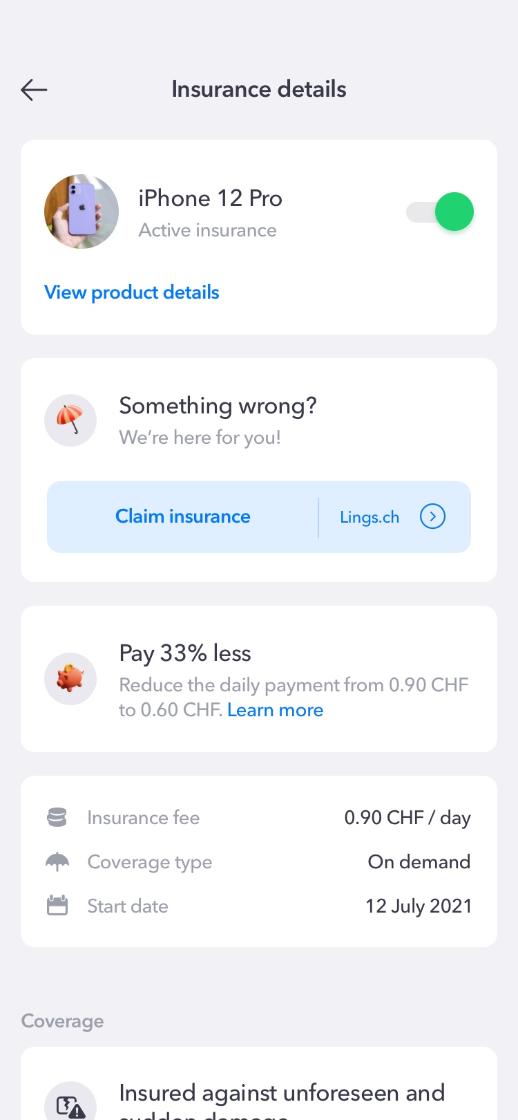
Insure the product
A simple way to add protection plans to the items that mattered. Users could review coverage options, get a quote, and purchase insurance in just a few taps — turning a stressful moment into a calm, confident decision.
My Role
As the Senior Product Designer—and effectively Head of Design—I was involved throughout the product lifecycle.
I worked closely with founders, researchers, product managers, and engineers to shape both the experience and the product direction.
My responsibilities included:
- Defining UX strategy
- Writing user stories
- Designing user flows
- Creating wireframes
- Building the entire visual language from scratch
- Designing the complete iOS app
- Designing the Android experience as the product expanded
- Participating in discovery interviews and usability testing
- Working daily with engineers to bring designs into production
- Contributing to roadmap planning and product prioritization
End-to-End Ownership
Being the only designer meant there was no handoff between UX and UI.
I owned the entire design process from the first whiteboard conversation to the final shipped interface.
The Hardest Problem Wasn't Design
Designing the interface wasn't the biggest challenge.
Making people come back was.
Most users only needed the app when they bought something or when a warranty expired.
That raised an important product question:
How do you create long-term value for something people only think about occasionally?
Many of our discussions revolved around that challenge.
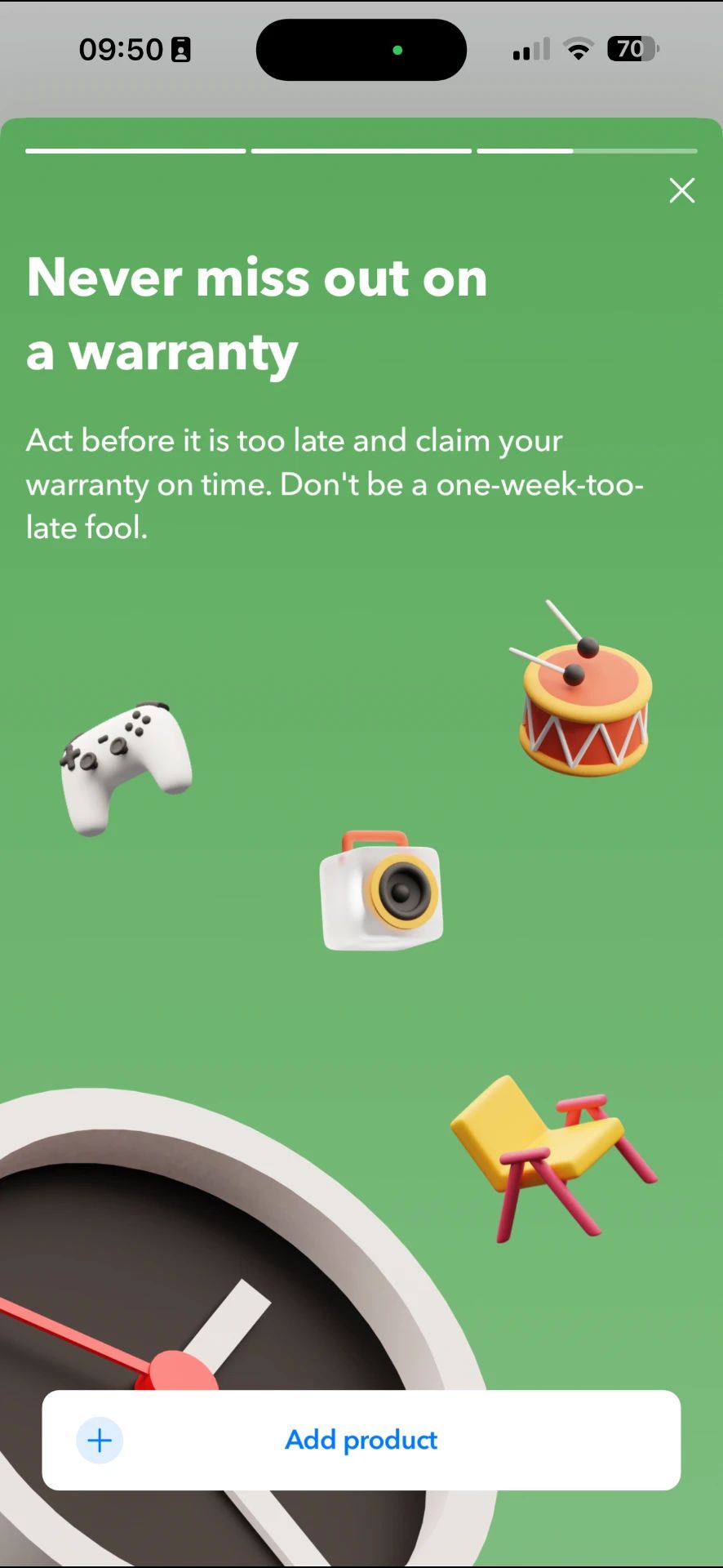
Product tips, Brand Spaces, warranty reminders, insurance, and additional ownership services weren't isolated features—they were all attempts to make the app useful long after the receipt had been uploaded.
That experience taught me that retention isn't something you design with a single feature.
It's something you earn by continuously solving real problems.
What Changed My Perspective
ZenOwn gave me one of the biggest mindset shifts of my career.
Before this project, I spent a lot of time thinking about how interfaces should look.
After this project, I started thinking much more about how little people should have to think while using them.
People don't open an app because they admire beautiful interfaces.
They open it because they have a problem.
The faster you remove friction, the more valuable your product becomes.
Good visual design builds trust.
Great product design removes effort.
That lesson has stayed with me ever since.
ZenOwn Today
ZenOwn eventually moved beyond the consumer app. Today, it's an AI technology company that helps consumer goods brands improve in-store product visibility, retail execution, and post-purchase consumer engagement.
The mission stayed the same: turn the moment after purchase into an ongoing relationship. Only now, ZenOwn does it for brands instead of individual owners.